I am a huge Pokémon fan and I have been since I was 8 years old. I know that most people have heard of the Pokémon franchise to some extent, but many might not know much beyond Pikachu or Charmander. The angle in which I approached telling this story was explaining it to an unfamiliar audience so that they too can understand.
This project delves into one of the most famous battles in the history of the competitive Pokémon scene. As a bit of context, The Pokémon Company International hosts a yearly battling competition called the Video Game Championships (VGC). This project focuses on VGC 2014 Worlds, when a Korean player by the name of Se Jun Park rose to popularity with an unconventional Pokémon on his team, Pachirisu, which ended up helping him win the championship title.
The site is broken up into sections to help with the natural progression of the story: explaining of what VCG is, an overview of the metagame in VCG 2014, why Pachirisu was such an unconventional choice, why Se Jun picked it for his team, how it fared in battle, and the legacy of this battle.
There are many different areas on the site where users can interact. For example, there are many places where users can click on a term for more information. Here is one such example:
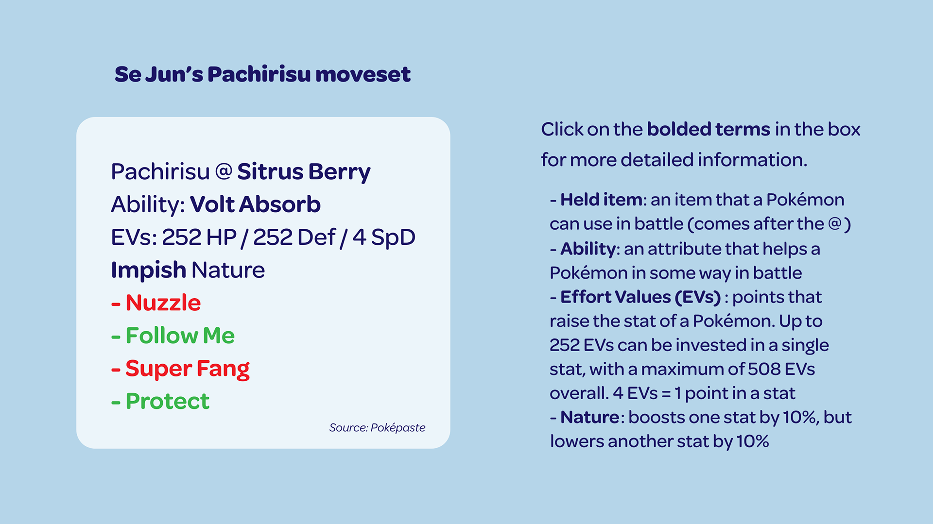
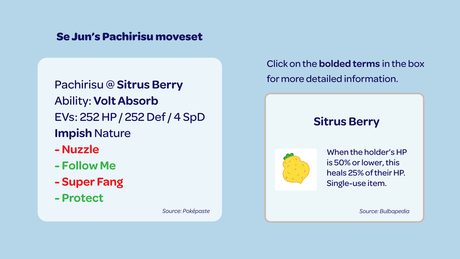
The white box shows the full moveset that Se Jun used for his Pachirisu. There are many terms that might not make sense to the user, but the glossary to the side briefly explains what they mean. By clicking on any of the bolded terms in the white box, another box pops up to the side to explain what the specific term does. These photos demonstrate what would happen if a user clicked on the bolded Sitrus Berry.
Another important aspect of this project is the use of infographics. The infographics, such as the two below, help to showcase information in a more digestible way.
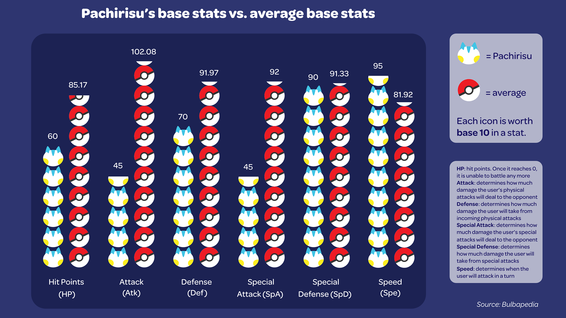
The infographic above shows the comparison between Pachirisu and some of the top threats of the VCG 2014 metagame. The 12 top threats (explained in a previous section from this chart) were averaged together to determine the stat numbers for the "average". There is a key and glossary to the side explaining what the symbols mean and what they represent, and what the different stats do. There are more paragraphs below the chart further explaining what the chart means (in short, that Pachirisu is below average on almost every single stat, which is why nobody wanted to use it on their team).
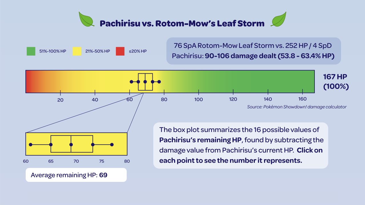
This infographic showcases how much damage the attack Leaf Storm dealt to Pachirisu. In short, every single attack in Pokémon has 16 possible damage values it can deal to an opponent. The darker blue box states the exact damage calculation, but to someone who doesn't play Pokémon, it might be hard to understand or visualize what the numbers mean. I took those 16 damage values, subtracted each one from Pachirisu's remaining health (167 HP), and created a box-and-whisker plot with those new 16 values to visualize how much HP it had left after the attack. The large, multicolored bar is supposed to emulate the HP bar in the games, with the color coding matching how the HP bar changes color in the games depending on the Pokémon's remaining HP. The bar zooms in further on the box-and-whisker plot to better see the numbers. Clicking on any of the five points shows a small white pop-up box of what exact number it represents.
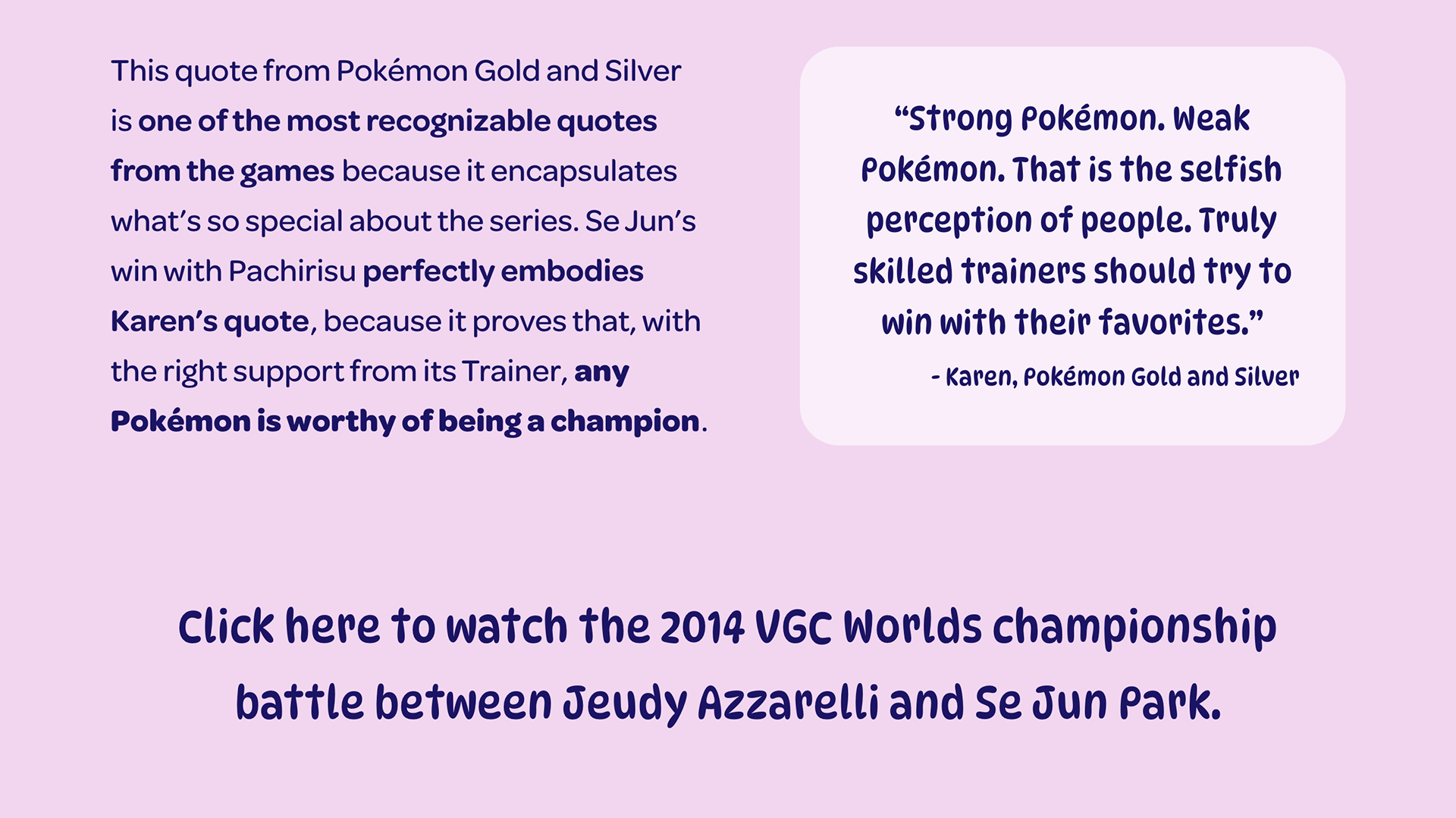
The end of the page has a hyperlink to the video of the championship match acting as the call to action. Users can watch the match in full with a better understanding of the match, having just read through the site. The site mostly focuses around the Pachirisu, so this also lets users see some of the other action that occurred in the championship match not discussed in the site.
You can read through the entire infographic below.