The basis of this project was inspired by a Japanese adage: "Neko no te mo karitai", which translates to "I'm so busy, I could even borrow a cat's paw". The meaning is that someone is so stressed that they would even ask a cat for help. I thought this was a great idea for a boutique hotel, where someone could escape all their stress. This also got me inspired by cat cafés, where people can relax with cats and enjoy a nice cup of tea.
Thus was born Cat's Paw Inn: the world's first cat-café boutique hotel, (hypothetically) located in Portland, Oregon, USA. Guests would be able to invite cats over to their rooms and give them treats and toys. They could even adopt a cat if they felt particularly attached to one. There is also a café area where guests can enjoy cat-themed desserts and such.
When deciding on the name of the hotel, I was debating between the Japanese translation (Neko no Te) or the English translation (Cat's Paw). While I ultimately decided on the English translation, I kept the Japanese translation (ねこのて) to use in the graphics. I wanted to keep them cutesy and "kawaii", so the main colors I used were white, mint green, and light pink, with a warm brown for text legibility.

The stationery kit is a very shallow container that contains a room key holder, notepad, and pen (all shown in later images). It opens by lifting the cat ears out of the slits, then lifting the other flap from the cat-paw shaped thumb hole.
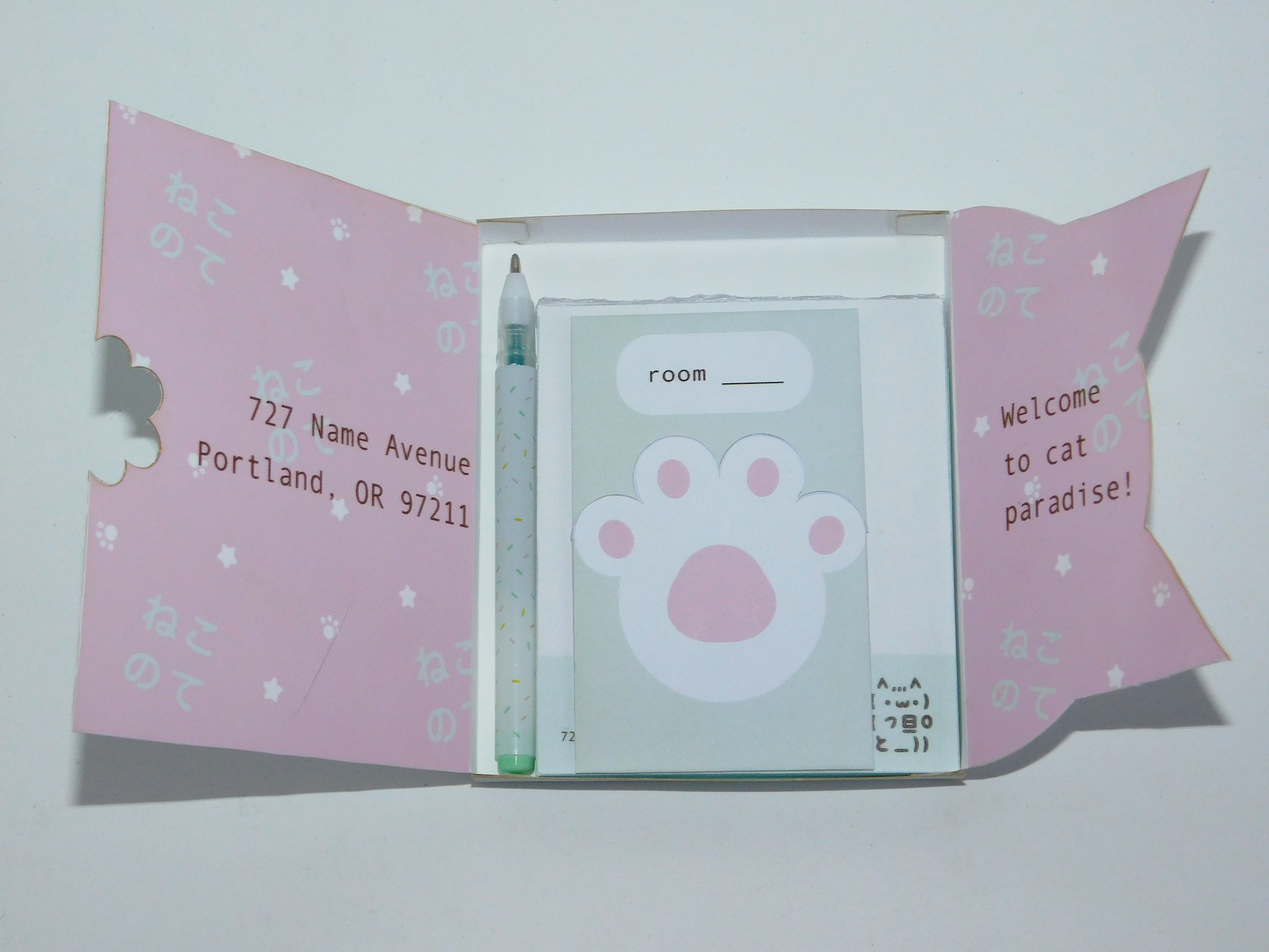
The inside of the flaps has the same pattern as the outside, but with the colors inverted. They also have the address of Cat's Paw Inn and the tagline, "Welcome to cat paradise!" The room key holder is a two-piece sleeve that separates at the toes of the cat paw. The user would remove the top sleeve and hold the key card against the reader on the door to enter their room. The miniature pen fits along the side of the stationery kit.

The notepad is bound at the top, similar to standard hotel notepads; users would tear sheets off from the top. It has the name and address, as well as the logo, in a mint green bar along the bottom of each page.

The welcome kit is a tray that holds six containers of goodies: 2 coffees, 2 teas, and 2 trail mixes. The containers are modeled after milk cartons, and they are tied together with yarn. The tray has more cat shapes, with the cat ears in the back and the whisker cutouts in the front. The back side of the tray has the name, address, and logo. By removing the goodies, it reveals the tagline along the backside. Like the stationery kit, the tray and goodies have the pattern inverted.

To help with differentiating the goodies from each other, each type has a slight variation on the logo cat: the eyes are turned up on the coffees, turned down on the teas, and the logo cat is unchanged for the trail mixes.
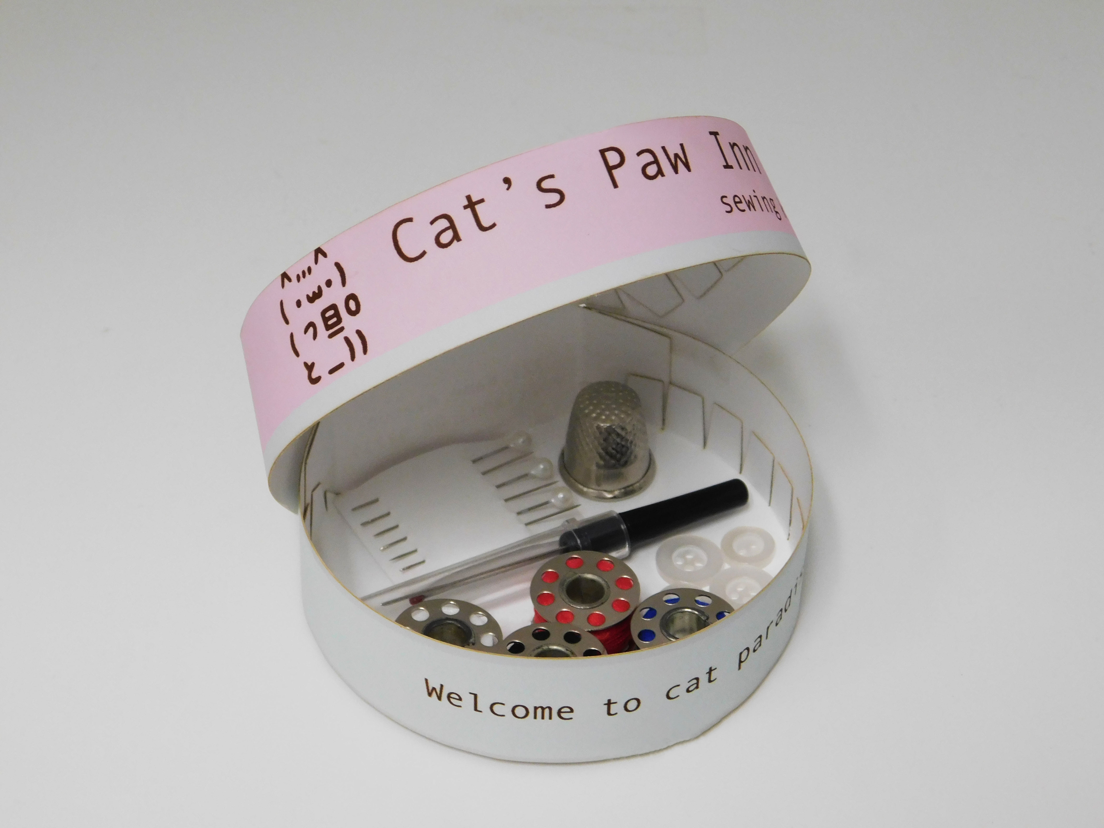
Lastly, the sewing kit is a clamshell container containing needles, pins, buttons, threads, a thimble, and a seam ripper. The container is modeled after a tuna can: short and round. It is light gray like a tin can, and the pink and green bands on the side do not reach the full height of the "can" like the paper label of a tuna can. Opening the lid reveals the tagline. The back side is flat and contains the hotel's address.
For an animated logo, I wanted to continue with the theme of text-based art in the branding: the ASCII art logo, the Japanese text in the patterns, and the monospace font for the information on the packaging. The animation resembles someone typing out "Cat's Paw Inn" on a computer, with the "cursor" blinking for a few seconds after the full name is typed out. Finally, the logo cat playfully winks at the viewer!
I also made an announcement post that would be posted on social media sites like Instagram. The animation is 20 seconds long, and I wanted to draw in viewers with the striking (and true!) claim that this is the world's first cat café hotel. I used the same patterns and cat shapes from the packaging system for more brand consistency, and I once again used the "typing" animation to lean into the theme of text-based art.
(Please note that the black borders would not be included in the final post; they are only included so that the animation would upload to YouTube as a video and not a short, which I would not be able to embed here.)